How to Embed a Design System in Obsidian
Over the last two months, I've been building my own experimental agent SDK. To get immediate feedback on how the agents were behaving, I built a set of React UI components in Electron and embedded them in a dedicated chat app. But I wasn't trying to build another chat app though; I was trying to create a Cursor experience within my favorite note-taking app, Obsidian.
So when the MVP of the SDK was finished, it was time to build out the Obsidian plugin to house these agents. I obviously didn't want to rewrite from scratch the UI I had built. But I also couldn't just naively import it. Unlike my Electron app, I don't have complete ownership over the styling. My plugin just gets to contribute UI to the platform, along with all the other developers in the ecosystem writing plugins, themes or the core. And that means the final computed style for components depends on more than just my code.
That led me to the topic of this post:
How can you reuse styled UI components from an application you own in a plugin for an application you don't own?
But could equally be softened to "how to reuse an existing styled UI component you found online".
I'm going to focus on integrating specifically a ShadCN + Tailwind design system into Obsidian, although the principles may be extrapolated to other class-based design systems too.
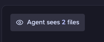
That means the rendered components look something like this:
<button class="... bg-primary/10 text-primary hover:bg-primary/15 hover:text-primary" type="button"...
The Easy Part: Token Mapping
When we ask for bg-primary, Tailwind is already aware of primary as a color in our design system's palette because I have introduced it through the Tailwind theming mechanism. Instead of directly defining the values, we use CSS variables to defer making a decision on what the colors actually are.
@theme inline {
  --color-background: var(--background);
  --color-foreground: var(--foreground);
  --color-primary: var(--primary);
  --color-primary-foreground: var(--primary-foreground);
  --color-border: var(--border);
  --color-ring: var(--ring);
}
That means each host application only needs to define --primary, --background, --border, etc. The shared component code can stay the same.
In the Electron app, I can then use Franklin's own theme values:
:root {
	--background: oklch(0.96 0.012 88);
	--foreground: oklch(0.21 0.04 302);
	--primary: oklch(0.21 0.04 302);
	--primary-foreground: oklch(0.92 0.035 88);
...
}
But in Obsidian, I don't want Franklin's color palette to be the source of truth. Obsidian already exposes a large set of theme-aware CSS variables, and those variables are what community themes customize. So the Obsidian plugin defines the same Franklin tokens by forwarding them to Obsidian's CSS variables:
.franklin {
	--background: var(--background-primary);
	--foreground: var(--text-normal);
	--primary: var(--interactive-accent);
	--primary-foreground: var(--text-on-accent);
...
}
✦ Insight
Components should depend on the design system; the design system should depend on the host application's theme variables. The application owns theming, not the reusable components.
The Hard Part: Winning the Cascade
If you are a pro at CSS already, or want to skip to the solution (which is to use a prefix PostCSS plugin + a root element), go here
Now we have primary mapping to the same color as the theme's primary color. But when I ran it, my buttons with the bg-primary/10 class did not take on the primary color and were instead using a neutral tone.
ⓘ Note
bg-primary/10is Tailwind for having a primary background with 10% opacity
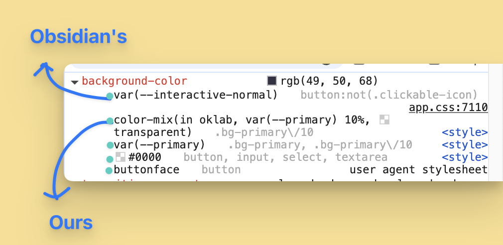
Examining what Chromium DevTools was computing, it seemed like my bg-primary/10 was being subordinated by the rule with selector button:not(.clickable-icon) coming from Obsidian's stylesheet app.css.
That means we need to carefully consider the implications this Obsidian setup has on the CSS cascade. The Cascade Algorithm determines which style properties apply to an element, in the presence of multiple candidate rules. Conceptually, for a given property (like color), it is a multi-pass filter on all available CSS rules where, at each pass, we sort the remaining candidates and filter those not in the top bucket. By the end, we are left with at most one winning declaration.
Let's now examine what happens to the two background-color declarations at each pass of the algorithm:
Pass 1: Relevance
We discard all rules whose selector does not match the element. What we are seeing in DevTools is exactly the list of declarations whose rule passed this phase.
Pass 2: Origin & Importance
- We may associate an origin with each stylesheet (and therefore with its rules and declarations). There are three:
user-agentorigin (i.e. browser-provided)user(i.e. user-customized)author(i.e. application-defined)
- A declaration may also be flagged as
!important(and if not marked, is then considered normal) - We bucket declarations by both origin and importance. We then order buckets so that:
- Important buckets are higher priority than normal buckets (naturally)
- For normal declarations,
authorcomes first, thenuser, thenuser-agent. - For important declarations, this order is reversed!
- Then we let the declarations in the highest-priority non-empty bucket through to the next stage.
- E.g. if there were 0 author declarations, 3 user declarations and 2 user-agent declarations, then we would only consider the 3 user declarations in the next step. However, if we also had one important user-agent declaration, that would win
You can see this at play in our running example:
app.cssis Obsidian's provided stylesheet and it has anauthororigin.<style>is referring to my Obsidian plugin's stylesheet (the thing we have control over) and it is alsoauthororigin.ButtonFacevalue is provided byuser-agent, hence why it is at the bottom of the list

That means both Obsidian and our declarations have the same origin. No clear winner, so we need to go on to the next pass.
Pass 3: Specificity
The idea of this pass is that more specific selectors should take a higher priority. Intuitively, a selector with more conditions should trump one with fewer. But also, the category of condition is important and should be considered.
Formally, we take the basic selectors and assign a vector to them called a weight-value:
- ID Selector (like
#login-button) =1 0 0 - Class selectors (like
.btnor pseudo-classes like:hover) =0 1 0 - Type selectors (elements like
por pseudo-elements like::before) =0 0 1
Remember, selectors may be composed together using combinators to create more complex conditions. You therefore sum together all constituent weight-values, column-wise.
To compare two weight values, you find the first column where the vectors differ and the one with the higher number wins. For example:
0 5 1>0 2 3because they differ in the second column and 5 > 31 0 1>0 10 0because they differ in the first column and 1 > 0
So to compare the selectors of our running example:
- Obsidian =
button:not(.clickable-icon)=0 1 1- The
buttonis a type selector because it matches the element<button>, and contributes0 0 1 :not(.clickable-icon)contributes0 1 0(technically the:notadds nothing, but the.clickable-iconinside it is a class name and so contributes to the second column)
- The
- Ours =
.bg-primary/10=0 1 0(single class)
This explains why our declaration loses out to Obsidian's!
Exploring the Decision Tree of Solutions
Ideas
There are basically three ideas I considered, each targetting a different pass:
- Use the important flag (
!important): I opted against this primarily because the flag is especially justified as a user/accessibility override, and our goal of defining a style override is spiritually different. - Layers: As a newer kind of Pass 2.5, CSS has a layer mechanism in which you may define and order "layers", put rules in those layers, and higher priority layers with the same origin and importance always trump lower priority ones. However, unlayered rules always beat layered rules, and since Obsidian has virtually everything in unlayered rules, there is no point adding layers because this can only decrease our priority.
- Increasing Specificity: The most natural choice. We pick our fight at the exact pass we are losing at.
With a little more analysis, I came to the conclusion that we really just want to be adding another class selector because:
- Playing around with IDs isn't practical. A document can only have one element with a particular ID, and our design system totally ignores them anyway
- Because of the way weight-values are compared, if, ignoring IDs, we can win at the class-selector column, we are guaranteed to win. Whereas if we try winning at the type-selector column (i.e. with more matching elements) then we are not guaranteed to win if our class-selector is inferrior.
Implementation
We need both: 1) for our selectors to have a higher class weight-value, and 2) for our selectors to still match! (otherwise we wouldn't get past the relevance pass)
Using the same ideas as this repo, the trick is to use a Prefix PostCSS Plugin in order to add weight to every Tailwind selector. Tailwind scans your codebase for any class tokens that are part of its language, then it generates tiny utility classes to define them. With the prefix plugin, you are asking the build system to take all these generated classes and modify their selector to include another class. I chose to prefix with .franklin, which is the name of the project.
import prefixSelector from 'postcss-prefix-selector';

const FRANKLIN_PREFIX = '.franklin';

/** PostCSS plugin that wraps every selector with `.franklin`. */
export function franklinPrefix() {
	return prefixSelector({
		prefix: FRANKLIN_PREFIX,
        // Avoids prefixing a selector that already contains the prefix
		exclude: [/\.franklin/],
		transform(prefix, selector) {
            // Doesn't make sense to add the prefix to "root element" because by definition
            // it cannot have a parent with `.franklin` and so would never match.
            // Instead, we treat the `.franklin` wrapper element as the virtual root.
			if (selector === ':root' || selector === 'html') {
				return prefix;
			}
			return `${prefix} ${selector}`;
		},
	});
}

...

const cssEntry = resolve(srcDir, 'styles/globals.css');
// Run Tailwind THEN prefix.
const processor = postcss([
	tailwindcss({ optimize: isProd || !isWatch }),
	franklinPrefix(),
]);
const css = readFileSync(cssEntry, 'utf8');
const result = await processor.process(css, {
	from: cssEntry,
	to: resolve(distDir, 'styles.css'),
});
And here is what appeared in styles.css:
.franklin .bg-primary\/10 {
  background-color: var(--primary);
  @supports (color: color-mix(in lab, red, red)) {
    background-color: color-mix(in oklab, var(--primary) 10%, transparent);
  }
}
This solves part one. In order to actually get this selector to match, we need an ancestor of the element to have the .franklin class because we have combined the selectors together with a Descendant Combinator. All we had to do here was go to the root component that we were mounting the React element into and add the class!
contentEl.classList.add("franklin");
root = createRoot(contentEl);
root.render(component);
Now, our button matches the selector and .franklin .bg-primary\/10 wins against Obsidian's because it has a weight-value of 0 2 0 versus Obsidian's 0 1 1.
✦ Insight
In addition to increasing specificity, this approach also scopes all our styles only to our plugin's components.
What is also beautiful about this approach is that we did not need to touch the custom button's implementation. We only added a build step and a wrapper component!
Caveats
Our solution raised the weight-value by 0 1 0. That was enough for the conflict in our running example, but unfortunately there are some Obsidian selectors at 0 2 1 and above. For example:
input[type="text"]:hover {
  background-color: var(--background-modifier-form-field-hover);
  border-color: var(--background-modifier-border-hover);
  transition:
    box-shadow var(--anim-duration-fast) ease-in-out,
    border var(--anim-duration-fast) ease-in-out;
}
From what I've observed so far, these more specific cases haven't had a noticeable enough effect on the "intended" design of components to warrant shielding against. But you can probably imagine how we might go about that:
- Use multiple class prefixes
- Add them all to the root
One obvious downside would be that this starts to get quite nuclear just to address a shrinking set of edge cases, all at the cost of bloating styles.css.
ⓘ idea
It dawned on me that potentially combining the prefix method (as a way to scope) and also a PostCSS plugin to add
!importantto all generated Tailwind declarations may actually be a good synergy, but I haven't yet explored if we get some unintended issues.
Organizing the Codebase
Before finishing off, I wanted to give a rough notes on how I structured and packaged this.
There are two independent packages here: Shared UI and the Obsidian Plugin. The relevant shape looks like this:
apps/
├── shared/
│   └── ui/
│       └── src/
│           ├── components/
│           └── styles/
│               ├── theme-tokens.css
│               ├── shared.css
│               └── theme.css
└── obsidian/
    ├── build/css/
    │   ├── build.mjs
    │   └── prefix.mjs
    └── src/
        ├── renderer/
        │   └── mount.tsx
        └── styles/
            ├── global.css
            └── theme.css
- Shared UI:
theme-tokens.cssmapsTailwind Theme -> Design Systemshared.css: Joins together all the mechanics to make reusing Tailwind components in any project. It includes@sourcedirectives: Make Tailwind scan the shared component code so those utility classes get emitted by the consuming app- Imports
theme-tokens.css
- (optional)
theme.cssallows multiple Electron apps to all define the sameDesign System -> Thememapping.
- Obsidian Plugin:
theme.cssdefines theDesign System -> Obsidian Thememapping discussed in "The Easy Part"global.cssis the entry point and imports the Obsidiantheme.css,shared.css, and also adds@sourcedirectives to pull any plugin-specific components.
Conclusion
Although this post focuses specifically on embedding ShadCN + Tailwind + React components in Obsidian extensions, the thought process is largely the same.
You need to:
- Understand how the host application deals with its own styles and with the plugin styles. You need a working model of how they interact during the Cascade algorithm
- Figure out the appropriate build steps needed to create all stylesheets for your components that adhere to the host's theme and that have higher priority than ambient defaults/overrides.
I have also left a couple of topics out of this post, but they are also important to consider:
- Portals: How do the shared portal components know which root component they should attach to? (hint: it can't be the container of the extension's view because modals will add a background dim/blur effect to only part of the viewport).
- Resets: We've discussed how to introduce explicit styles. On the other hand, the computed value for a style might be implicit. For example, Firefox adds this rule to style visited links:
:visited { color: VisitedText; }. But changing the host (i.e. from your Electron app to Obsidian) also changes these values. The trick is to add each problematic case to areset.cssfile that has the exact same selector but is also prefixed by.franklin. Then, all elements scoped under the.franklinroot reset the host's defaults to something preferred. - Tailwind Preflight: Because host defaults vary across browsers, Tailwind tries to normalize values through its
tailwindcss/preflight.cssstylesheet. Naively importing this in a plugin is a bad idea though because it is unscoped, hence why I omitted it fromglobal.css